8/2/16
Red States/Blue States
While I was watching the conventions these last few weeks, I noticed, yet again, that the Republicans got the red power ties and the
Democrats didn’t. What’s up with that?
And then: What makes a power tie? And more importantly, who decided who got which color? And how did
that happen?
So let’s start with power ties. Colors have different
meanings in different societies, but at least in western cultures, colors that
stand out, like red (and yellow and pink), make the person wearing them more “salient”
or noticeable. And salient people are seen as more powerful. Thus the power tie. It works for dresses, too. On the other hand, blue looks
great on TV and is considered the most popular color.
But on to the political parties. Why red and blue? How did
that come about? Turns out, it’s mostly
about television. Color television. Here’s a little summary sheet of how the
networks reported presidential election results state by state from 1960 to
2000.
Washington Post
As color television became more commonplace, networks were able to use colored maps to show how the vote was
going. For quite a while,
the Republicans were mostly blue. Amazingly, this was likely a leftover from the Civil
War, when the northern troops, the army of Lincoln, wore blue, so blue became Republican. Grover Cleveland
even used blue to denote Republicans in his 1888 run for the White House
because he felt it identified him with The Union. Politically, red has been seen as the color of
revolution, which dates back to the French Revolution
and the revolutions of 1848. The color represents anger and the blood of those
who died seeking freedom from oppression.
“Red,
the color of angry men, Black, the dark of ages past!”
The Red and Black Song: Les Miserables
2012 Les Miserables
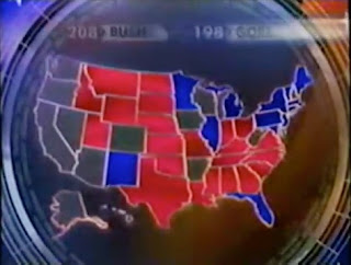
Until we get to the 2000 Bush/Gore contest. CBS had been
using red for Republicans and blue for Democrats since the 1988 mid-term
elections. As the tally of votes went on for days and days (Remember the
hanging chads?) and the colored maps were shown for days and days, consensus eventually
developed. Here's how:
"The colors for United States electoral maps did not get standardized until the 2000 election, when the New York Times and USA Today both used red for Republicans and blue for Democrats. According to Archie Tse, who was senior graphics artist at the New York Times in 2000, "“I just decided red begins with ‘r,’ Republican begins with ‘r.’ It was a more natural association. There wasn’t much discussion about it. Paul Overberg, the database editor who made USA Today's online electoral map in 2000, indicated that he assigned red to the Republicans and blue to the Democrats, because of the large number of Republican states in the Mountain West region of the U.S. According to Overberg, "If it had been flipped, the map would have been too dark,” he said. “The blue would have been swamping the red. Red is a lighter color.""
Finally, Tim Russert of Meet the Press coined of the term red states/blue states, and so it has been ever since.
Here’s a sample of what it looked like as the colors evolved:
1968 NBC Washington Post
1976 ABC Washington Post
1980 Smithsonian Magazine
1984 CBS Washington Post
1992 ABC
2000 NBC
2016


Great research! I love this type of social history.
ReplyDeleteThis comment has been removed by the author.
ReplyDeleteThis comment has been removed by the author.
ReplyDelete